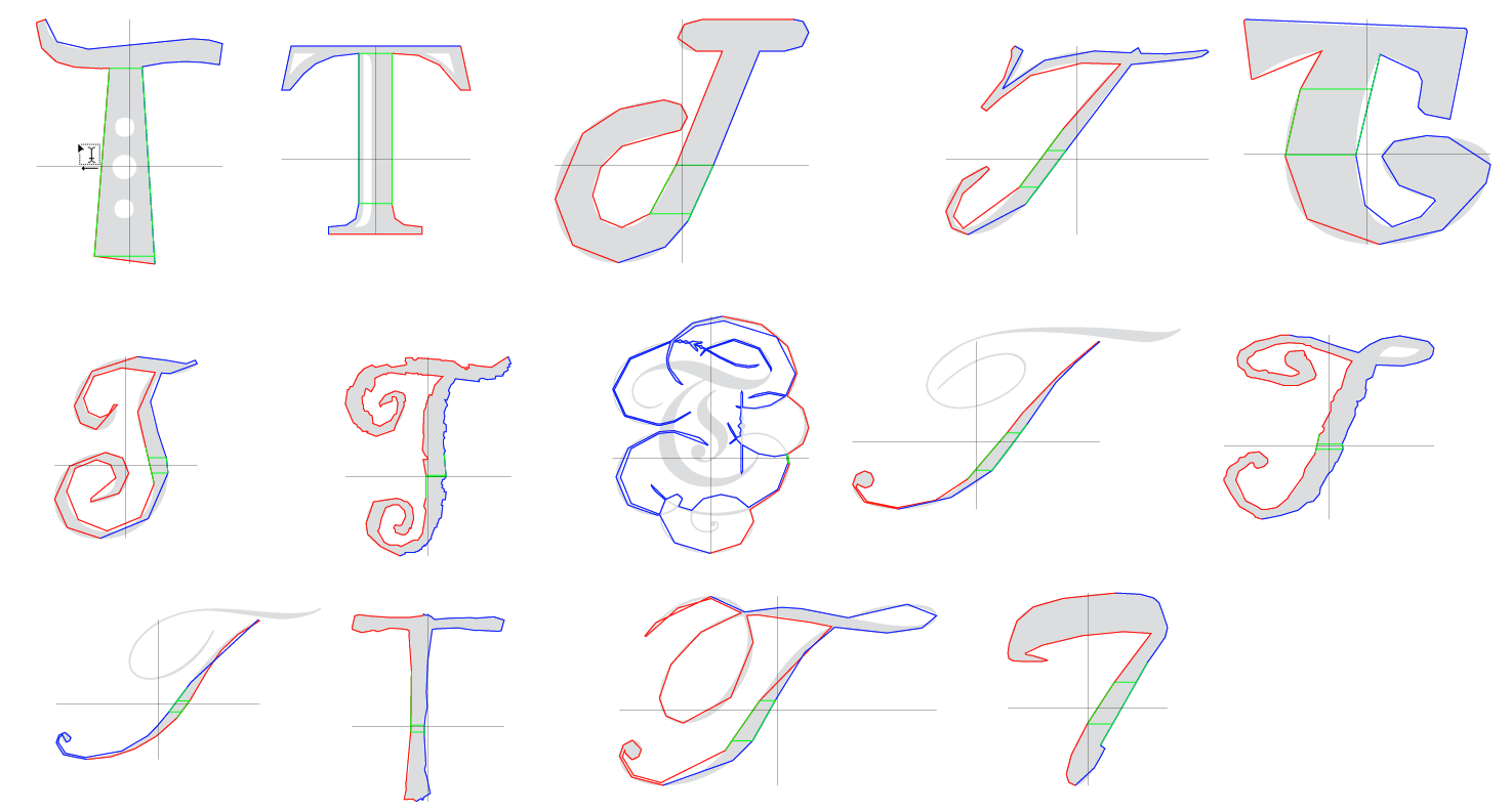
Glyphs for debuging
Well the answers like this:
💡 Take a sample letter which is comparatively simple to measure like an English T, Arabic Alef , Hebrew Vav
or Japanese Shi
etc. basically glyphs that have a long vertical to them and not too much else. A, Q, W or M wouldn't be good ideas. For our script we only dealt with English fonts (Freebie) but integrating the other language scripts should be very simple, just as one hint the font's writingScript property could be a useful property for deciding the 1st choice of which glyph to check for. Convert the T or whatever into outlines
myT = myChar.createOutlines(), manually you would find the "create outlines" option in InDesigns "Type" menu.
💡 The T outline could be made of several paths take the T on the far left of the bottom row of the "Feature" picture, it has 2 separate paths, others might have quite a few more, so which path do we go for? That's right the tallest one, that's the one that's most often is going to be the stem of the T. To measure the height of each path all we need to do is loop through the entirePath of the path and take note of it's highest and lowest points. Height = highest – lowest.
💡 Now we know which path is the one to go for and what it's high and low points are we can easily split the T vertically. Where T is the entirePath and l is the amount of anchor points in T then side1 = T.slice(lowestPoint.index, 1 + highestPoint.index); and side2 = T.slice(highestPoint.index, l + 1).concat(T.slice(0, lowestPoint.index + 1)); If you don't understand the terms slice or concat then do some home work. In our picture above the red outlines are side 1 and the blue ones are side 2. To simplify things we've just played dot to dot with the anchor points and ignored the left and right direction handles that form the Bezier curves. When I wrote my Illustrator API (sorry I'm too mean hearted to share that one for now) I dealt with all the Bezier maths needed to deal with the curves, that was real tough stuff, well at least for me but for the purposes of this freebie we can just look at the font as having no curves. The accuracy lost is actually normally going to be quite insignificant, remember the width we are measuring is the average or the 2 green horizontal lines that we're get to soon.
💡 Next we have to figure out were to measure our stem. That's were the debug pictures came in really useful as did my logging API. It took quite a few guesses to get the results we ended up with. Basically for both side 1 and side 2 and we look for the sets of anchor points that cross the 40% vertical point of the path. Why 40%? To stay as clear of the top of the T and the wider or narrower parts of the stem that might be lurking around its base.
💡 In most cases each side will only have one section that passes through our 40% vertical reference point. In some cases however there might be multiple "candidates" that pass through the reference point and we will then need to select one candidate from each side so we can measure the distance between them. In other words we need to elect a president and then find his closest running make to be the vice president. In our picture the president and his vice are the vertical green lines that overlay the red and blue outlines. To select our president we made up a very simple formula, it won't work in every wacko case but will work in well over 99.5% of the cases. The president will be the section belong to side with the least amount of candidates. If side 1 has 3 candidates and side 2 has 4 candidates then the president will be from side 1. The candidate of that side who is closest to our horizontal reference line (on the picture the black vertical lines in the middle of the glyphs) will be elected the president. In a case were each side has the same amount of candidates then the president will simply be the candidate who is closest to our horizontal reference point. Electing the vice president is really simple we just go for the bloke on the other side who is closest to the president. One can see this process nicely illustrated in the T on the left side of the middle row. It has 5 red candidates and 1 blue candidate. The president will therefore be the blue one and the vice will be the closest red one to him. If we'd have just gone for the candidate closet to our horizontal reference point then we would end up with the wrong president and a false result for the glyphs width. The horizontal reference point we used for our T was 50%, that would also be good for Arabic, for Hebrew you would probably use 100% and Japanese 0%.
💡 We now need to measure the distance between our 2 sides, that's pretty easy peasy, lets say our president's bottom point is [2, 20] and his top point is [10, 100] and our vise president has points of [40, 30] and [60, 110] then we find the common top and bottom points of both sides, in this case 30 and 100 then we choose the middle point of that (30 + 100) / 2 = 65 and work out the horizontal coordinates a that vertical. For each side x at mid point = start x + (mid y – start y) * width / height, Side 1: x at y of 65 = 2 + (65 – 20) * (10 – 2) / (100 – 20) = 2 + (45 * 8 / 80) = 6.5. Side 2: x at y of 65 = 40 + (65 – 30) * (60 – 40) / (110 – 30) = 40 + (35 * 20 / 80) = 48.75. Our width is going to be the difference of the 2 x points 48.75 – 6.5 = 42.25. As we drew our fonts at 100 point size then we divide our width by 100 to get a point ratio 42.25 / 100 = 0.4225, we can now use that ratio to calculate the width a any point size, for 12 point 12 * 0.4225 = 5.07 etc. The script actually uses a slightly less efficient way which measure thicknesses one a the top common point of 30 and one at the bottom point of 100 it then takes the average which is going to come out the same as the measurement of the thickness at the mid point of 65. The reasons were 1) Didn't think about the other way until we did it. 2) Like this we have a min and max thickness which might be useful.
💡 Now that we know how to measure the thickness albeit with some petty inaccuracies we can scan the document for text ranges and make a map of each font that's used and at which point sizes each font is used at. This operation should go very quickly. For each font draw the outlines and then calculate and categorize for each size used of that font to see if it's too thin. The script does not take into account the horizontal scale of the glyphs, to do so would be really simple and wouldn't normally take a significant amount of time. Dealing with the actual glyph scaling which should lie some were between the minimumGlyphScaling and the maximumGlyphScaling, desirably at the desiredGlyphScaling would be much more complicate and time consuming.
💡 Next, avoid DOM calls in particular ones that change the document merely to retrieve some information. The main reasons for this are: 1) The DOM manipulations like drawing shapes can be comparatively very slow. 2) They unnecessarily alter the document in a way that can corrupt it. 3) They can be much more complicated to work with than possible alternatives. With our goal here it would be tough to completely avoid drawing the glyph outlines. In theory we could decode the font files and work with them but that would be a real lot of work. What we can do however is after processing each font for the 1st time is to store the result in a file, each time we run the script we generate from the file a table of fonts and their width to point size ratios. When checking a font we look at that table if it's there good if not then we measure and add the font to the file. This way if we run the script one time on a systems fonts then after that no DOM manipulations (drawing outlines) will be required until a new fonts pitches up. Adding that new font is also going to be very quick. The big question is which type of file should we use? Answer: json. If we compare the speed of processing a xml file with a 1000 entries with and equivalent json file the json is going to be hundreds of times quicker, this is really significant. Because of the simple nature of the json we need for our script we avoid encompassing the entries with curly brackets, that way appending new fonts to the file ultra simple and quick.
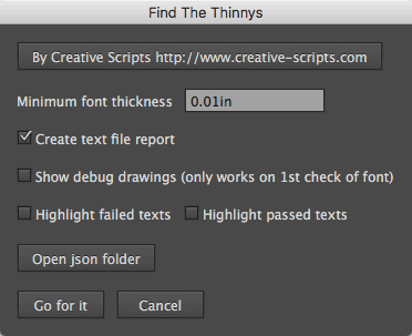
💡 By using the debug option one can check the thickness ratios and adjust the results to ones hearts content. Using the debug option severely slows down the scripts operation. In an average document your quite unlikely to have more than 20 fonts, so this slow down will be irrelevant but if your running off 1000s of font at a time then you will notice it big time. You might want to limit the number of font to 500 per document and they should be done pretty quickly.
💡 Until here we've dealt with calculating the glyphs thicknesses, the next stage is seeing which fonts and font sizes need to be calculated. Again simple stuff.
myStory.textStyleRanges.everyItem().appliedFont;
myStory.textStyleRanges.everyItem().pointSize;
Then loop through them make a map of fonts and the point sizes. that map can be processed and we can then categorize each font at a give point size as either good (not too thin), bad (too thin) or ugly (fonts that we couldn't measure). With those results we can do what we like, in our version we put together a simple UI with some basic options.
🤔 Until now we've been discussing all the geeky details that might have interested fellow scripters like myself 🤓, now we shall address the user 😼
👮 EULA 🚓
🚨 The script is as is.
🚨 Don't complain if you on bases of it's results you run off 15,000,000 copies of your new novel and you have to trash them because the the glyphs are too fine and the script said they were just perfect. Don't even bother leaving a comment on the post here, just have a cup of tee 🍵 or vodka 🍸 and carry on with life.
🚨 Don't complain if the script corrupts your theses which you have been working on since 1965, you deserve it, you should have made a back up 😈.
🚨 Don't complain no matter what.
🚨 Don't remove the "Creative Scripts" button.
🚨 Don't use if you ever sued.
🚨 Don't use if you were ever sued.
🚨 No law suits allowed.
🚨 Leave / put in the link to this post in the source code of any script that you contains code you took from the script. 👀
💰 Tips happily accepted if you gained a lot from the script and even if you didn't.
🎓 Instructions 🕵
🤔 Use your brains.
🤔 Back up your documents if you value them.
🤔 The highlight passed texts option is normally pretty much a waist of time and can take quite a bit of extra time to run on long documents.
🤔 The highlight texts options apply a conditional text to the texts that are highlighted. If those text already have conditions applied to them they will go away, disappear and vanish, OK you can do a command / ctrl Z but why insist on being a twit? Run the script on a copy.
🤔 If your working on a long document then you can use InDesigns find panel searching for the condition called "Thinny"
Here's my feature film hoped you like it 😋.
All the best Trevor
Here's the script 💾 Download
